 |
|


 Sep 17, 2009, 12:00 AM // 00:00
|
#1 |
|
Forge Runner
Join Date: Nov 2006
Location: Arizona, USA
Guild: [OOP] Order of the Phoenix I
|
 Request for a critique (Halloween contest entry)
Hi again -
I started this piece in mid August because I thought my goals were overly ambitious. I surprised myself by getting it done so early, tell me what you think! 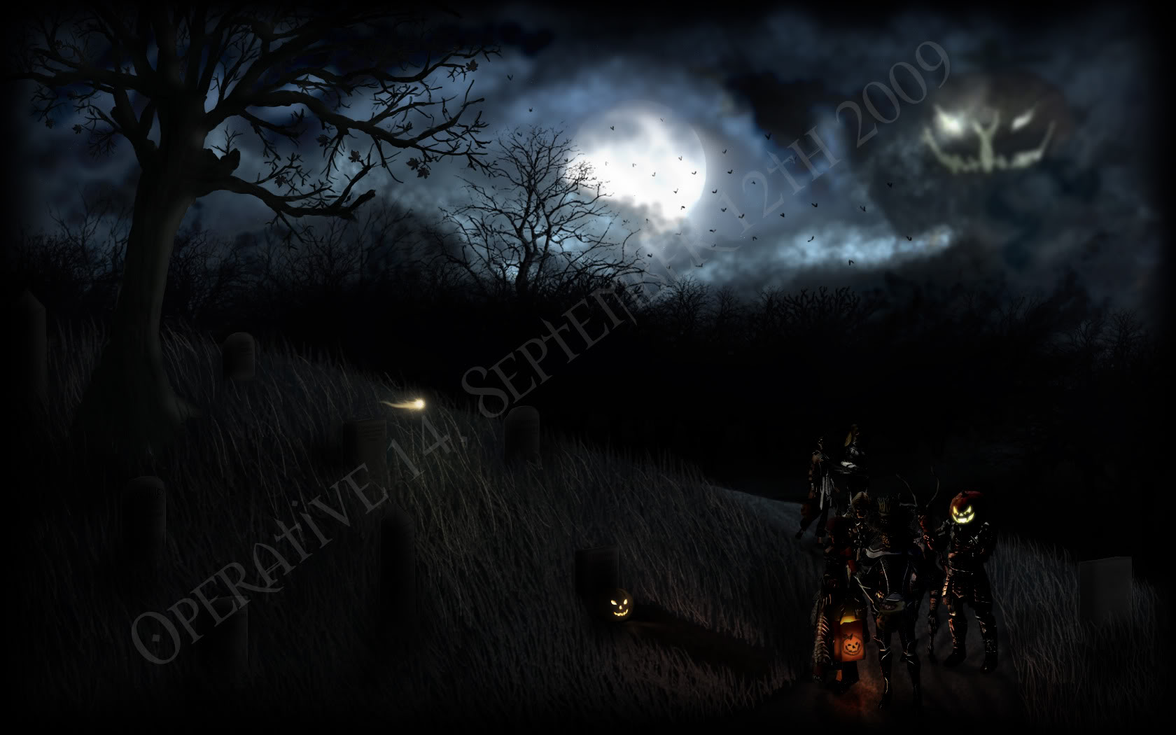 This is meant to be an entry for the GW Halloween art contest, as well as a personal wallpaper for myself. I drew a lot of inspiration from this piece, a plagiarized version of which was entered for last years contest (and won a significant prize, I believe, before it was discovered as such). The atmosphere it carried was absolutely perfect, and I wanted to attempt to recreate the style and soul. A main goal of mine was to create a truly original piece of art, not something that was just a careful manipulation of screenshots or what have you. To that end, I made everything you see by hand in photoshop, with the exception of my characters and Mad King Thorn in the background. The trees in the background are from a brush set, and the tree in the foreground on the hill was made by doing a rough trace over another tree, and then expanding on the details. The grass I made EACH AND EVERY SINGLE blade (I need to find a better technique for making grass >_<) and the tombstones (not the text mind you), pumpkins, the path, and the various trick or treat bags I drew freehand. I'll admit however that my Dervish's ToT bag is a blatant rip-off of the ingame GW trick or treat bag, but that's the intent. There's not too much of a story to the scene, though I'm sort of picturing it being in the middle of my characters trick-or-treating on Halloween. The main group has stopped, and my Elementalist (dressed as a scarecrow) is taking the opportunity to inspect the loot, while my Warrior and Ranger share a private joke. Next to them, my Necromancer is sulking because that's just the kind of character she is. My Dervish is either inspecting the fresh grave, the pumpkin, or the orb; I'll let the viewer decide. They've stopped to let my monk and Assassin catch up. Behind them on the path my Monk and my Assassin hurry to catch up to the main group, after being waylaid by an enticing conversation. If you can make them out, the tombstones have either funny sayings or, on a more somber note, are memorials to my deleted characters who I always try to work in for my Halloween works. Any comments are appreciated, and critiques are quite welcome. I was going to wait to post this until a more festively appropriate time, but I figured if I'm going to ask for advice I should do so early while I still have time to make significant changes if need be. Thanks for looking! 
Last edited by Operative 14; Sep 17, 2009 at 07:45 AM // 07:45.. Reason: Added watermarked image |

|

|
|
Sep 17, 2009, 12:18 AM // 00:18
|
#2 |
|
Academy Page
Join Date: Jun 2006
Location: Largo, Florida
Guild: United Aussie Warriors[AUS](1)
Profession: Mo/A
|

Looks great but try to brighten up, some of the character. Not too much just allow some of the silhouette to put out. A small issue I see with the pumpkin in the sky is: There is a light ray in front of the pumpkin that isn't following the same vanishing point there by making it look a bit out of perspective!(But not too noticeable!)
Over all, a dang good job! Word of advice protect your work if you are planing to submit this. As I've had my work stolen from here a few times once for hollowen and another for chrismas. Not a good feeling :{! Last edited by the pretender; Sep 17, 2009 at 12:22 AM // 00:22.. |
|
|
|
|
Sep 17, 2009, 12:49 AM // 00:49
|
#3 |
|
Jungle Guide
Join Date: Apr 2006
Location: California, USA
Guild: Vulpes Velox [Fox]
Profession: Me/
|
I understand based on the lighting that the characters are in the shadows, but in my opinion its wayy too dark. I cannot see any details besides I think a ranger with a pumpkin head. I can't see what the other two characters are but at least I can see one is holding a trick or treat bag.
Other then that, the sky and trees look beautiful. I'll be able to better judge it once I can actually see what I'm judging =P |
|
|
|
|
Sep 17, 2009, 01:03 AM // 01:03
|
#4 |
|
Forge Runner
Join Date: Nov 2006
Location: Arizona, USA
Guild: [OOP] Order of the Phoenix I
|
Hmm... I'm wondering if my screen is a bit brighter than usual; I've had comments in the past that images in games on my screen are brighter than on other peoples computers. I can make out the characters clearly, albeit they're mine and I can recognize them easily.
I was worried that if I made it too bright the realism of the image would suffer. It seems like on a dark, overcast night facing away from the main light source, the shadows would be very contrasting. Though by the same token the clouds would diffuse the light all around the scene. Thanks guys, tis exactly what I needed.
|
|
|
|
|
Sep 17, 2009, 01:18 AM // 01:18
|
#5 |
|
Forge Runner
Join Date: Aug 2007
Location: WHERE DO YOU THINK
Profession: W/
|
You need to brighten the characters up some how, they are hard to make out.
I am also so excited for Halloween now, definitely love the feel of it more then any other holiday. Last edited by Kerwyn Nasilan; Sep 17, 2009 at 02:08 AM // 02:08.. |
|
|
|
|
Sep 17, 2009, 01:27 AM // 01:27
|
#6 |
|
Krytan Explorer
Join Date: Jan 2009
Location: Canada
Guild: The First Dragon Slayers [FDS]
|
Yes, I'd have to agree that it is too dark. The sky and such is fine. Just around the grave stones and characters needs brightness. ofc I'm not artistic but that's just my view, if I can't see the details that you mentioned, the judges wont and that will be a point against you.
Its absolutely marvelous, just add the light where needed. |
|
|
|
|
Sep 17, 2009, 02:17 AM // 02:17
|
#7 | |
|
Wilds Pathfinder
Join Date: Nov 2008
Location: California
Guild: Lucid Spirits [LIFE]
Profession: N/A
|
I'll join the "too dark" crowd. I know you are going for correct lighting, but... I think Scott Sava (of Dreamland Chronicles semi-fame) put it best:
Quote:
 Also, what is that little glowy will-o-the-wisp thing up on the hill? Is that the orb the Derv is inspecting? Overall, a great concept, and it's shaping up to be a great piece! Reminds me of my old trick-or-treating days... but eerier. |
|
|
|
|
|
Sep 17, 2009, 06:10 AM // 06:10
|
#8 |
|
Jungle Guide
Join Date: Apr 2006
Location: California, USA
Guild: Vulpes Velox [Fox]
Profession: Me/
|
Oh wow, I didn't even notice there were gravestones and grass on the hill! Looks much better now. However I have to kinda squint to see the characters, I'm not sure if its because they are too small or that the lighting is still a little dark on them. Since it is for a GW themed contest, I think that they should have more focus in the picture.
Definitely has improved though. =) GJ! |
|
|
|
|
Sep 17, 2009, 06:11 AM // 06:11
|
#9 |
|
Forge Runner
Join Date: Nov 2006
Location: Arizona, USA
Guild: [OOP] Order of the Phoenix I
|
Yep, tis an obligatory Orb because I like them.
And thanks guy, I'll go back and try to make the scene a little less dark.
|
|
|
|
|
Sep 17, 2009, 07:12 AM // 07:12
|
#10 |
|
Forge Runner
Join Date: Mar 2006
Location: Mableton, Georgia
Guild: Guild Ancestors Reunited [ギルド]
|
What I think is that you should have watermarked this picture so no one tries to steal it as their own.
On-topic: I think the picture is 3 or 4 shades too dark. ~LeNa~
|
|
|
|
|
Sep 17, 2009, 07:50 AM // 07:50
|
#11 |
|
Forge Runner
Join Date: Nov 2006
Location: Arizona, USA
Guild: [OOP] Order of the Phoenix I
|
Point taken about the security, especially since I mentioned that the piece I took my inspiration from was first brought to my attention because someone had plagiarized it and sent it in as their own.
*Adds watermark, hopes it is sufficent* I'm thinking that my monitor might be brighter than average. When I was going through and adding in the colors and shadows, I was using less than 10 shades above black. It became an issue because I couldn't get enough contrast in areas where I needed it, like shadows or the like. To me the image looks fine, if anything a little too bright. I'm going to play with it and see if I can't lighten it a bit. Thank you all thus far, your comments have been very helpful.
|
|
|
|
|
Sep 17, 2009, 08:09 AM // 08:09
|
#12 |
|
Jungle Guide
Join Date: May 2006
Guild: The Seraphim Knights [TSK]
Profession: E/A
|
You know that scarecrow piece?
That piece had a Razah pasted over it for a Halloween contest two years ago. The person who submitted the entry was not the original author, and after being declared a winner, his prize was revoked. |
|
|
|
|
Sep 17, 2009, 08:11 AM // 08:11
|
#13 |
|
Jungle Guide
Join Date: Apr 2006
Location: California, USA
Guild: Vulpes Velox [Fox]
Profession: Me/
|
Well if anything happens at least this thread exists as proof that it is indeed yours. I'd like to say let's hope we won't have to worry about that but considering how many people have won for stolen art lately...
|
|
|
|
|
Sep 17, 2009, 08:11 AM // 08:11
|
#14 |
|
Academy Page
Join Date: Sep 2009
Profession: Mo/
|
Hi, I've been idling here a while, so hi guys.
Let me start off with saying this is a great start! You've got a great atmosphere going which I think you were looking for. As the others have said the darkness of the characters seems to be the problem, I agree. Though I think the main issue is the lack of contrast around them. There's a huge wall of blackness behind them; there's no silhouette. With something light behind them it'll break up the clump of dark colours and hopefully make the characters "pop". Also maybe consider tightening the whole image, it seems a little spacious with not much going on in half. Consider maybe cropping it? Good luck with the competition.
|
|
|
|
|
Sep 17, 2009, 01:40 PM // 13:40
|
#15 | |
|
Wilds Pathfinder
Join Date: Nov 2008
Location: California
Guild: Lucid Spirits [LIFE]
Profession: N/A
|
Quote:
|
|
|
|
|

|
Sep 17, 2009, 08:04 PM // 20:04
|
#16 | |
|
Forge Runner
Join Date: Nov 2006
Location: Arizona, USA
Guild: [OOP] Order of the Phoenix I
|
Quote:
And yep Skye, that was originally how I found the original, when someone posted it to tell Arenanet what had happened.
|
|
|
|
|
|
Sep 17, 2009, 08:15 PM // 20:15
|
#17 |
|
Desert Nomad
Join Date: Jun 2005
Location: USA
Guild: Kirins of Holy Light
Profession: N/
|
It looks great! Things I would like to see for it: 1) The entire front scene brighter including the tree and the tombstones. If some of the trunk has light brightening it then the larger branches on that side should as well. 2) Another orb or two :-) Just one seems lonely. 3) The extra brightness to only one Mad King eye seems unbalanced/too bright, especially being the side closer to the moon.
There is going to be fierce competition this year :-) |
|
|
|
|
Sep 17, 2009, 08:40 PM // 20:40
|
#18 |
|
Forge Runner
Join Date: Nov 2006
Location: Arizona, USA
Guild: [OOP] Order of the Phoenix I
|
Thanks! I was sort of trying to make it look lonely, hence why it was coming out to see everyone.
Here's a newer, brighter version. What do you guys think? It looks almost a smidgen to bright in my opinion, though I think everything is a lot clearer. 
|
|
|
|
|
Sep 17, 2009, 09:00 PM // 21:00
|
#19 |
|
Desert Nomad
Join Date: Jun 2005
Location: USA
Guild: Kirins of Holy Light
Profession: N/
|
I would say the darkest parts of their armors are still too black. The detail is lost and with the highlights popping out so much the depth of the figures compared with the background seems really off.
I tried a quick adjustment to see if I could show what I mean since Im not good at putting things into words. The glowing trick or treat bag would cast a warm glow on the armors near it lighting the area up to their shoulders. It would kind of create a spherish glow lighting up most of the people near it. If you put them in layers to compare maybe you can see what I mean. (All this is just my personal opinion, others might see it differently) Last edited by KiyaKoreena; Sep 17, 2009 at 09:29 PM // 21:29.. |
|
|
|
|
Sep 17, 2009, 10:02 PM // 22:02
|
#20 |
|
Forge Runner
Join Date: Nov 2006
Location: Arizona, USA
Guild: [OOP] Order of the Phoenix I
|
Ah, yes, more of a diffuse glow. I like the effect, it doesn't look as harsh.
|
|
|
|
 |
|

«
Previous Thread
|
Next Thread
»
| Thread Tools | |
| Display Modes | |


 Linear Mode

|
|

All times are GMT. The time now is 07:39 AM // 07:39.
